
Support Center
Need more help?
Reach out to support@sosha.ai with any additional questions or submit a ticket below.
Submit ticketPost Styling
The Styling section lets you customize how posts appear on your live toolkit. As you make changes, a real-time preview shows you how your posts will look. You can either save your changes or click “Restore to Default” to reset your design.
How to Edit the Post Styling:
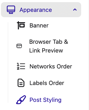
Go to the Appearance tab of your toolkit and open the dropdown menu. Click the Post Styling.
Edit the customizable design elements:

- Share Button Color: Choose either the default platform color (e.g. Twitter blue, LinkedIn blue) or a custom hex color.
- Button Text Color, Card Background Color, and Text Color: Select colors using a hex code (e.g. #FF5733) or use the color picker to choose manually.
- Text Size: Adjust the size of the post text displayed on the card.
- Card Corner Radius: Set how rounded the corners of each post card should be.
- Button & Media Corner Radius: Control how rounded the share buttons and media previews appear.
- Font: Choose the font used for both the post text and banner.
- Card Shadow: Add or remove a subtle drop shadow around post cards for visual depth.
Once satisfied with the changes, click save.